Typography Task 1 / Exercises
29/08/2022- Ending Date / Week 1- Week 6
Hisham Rasheed / 0356691
Typograpghy / Bachelor of Design in Creative Media / Taylor's
Task 01: Exercises 1 and 2
LECTURES
Week 1 - Lecture 1
1. Early Letterform Development: Phoenician to Roman

fig 1.1: Evolution from Phoenician Lette
The writing was initially the scratching of sharpened sticks into wet clay
or stones that were carved with chisels. Letterforms were largely derived
from the tools and the medium of writing that were used to write.
.png)
fig 1.2: Direction of writing
2. Hand script from 3rd-10th century C.E.
.png)
fig 1.3: 4th or 5th century Square Capitals
The compressed version of square capitals allowed for twice the number of
words on a piece of parchment and took significantly less time to write.
They were faster and easier to do, but slightly more difficult to read due
to their compressed appearance.
.png)
fig 1.4: 4th to 5th-century Uncials
Uncials, Some characteristics of the Roman cursive hand were incorporated.
Uncials are short letters. At small sizes, broad forms of uncials are more
readable than rustic caps.
.png)
fig 1.5: 500 half uncials
Half uncials, 2000 years after the foundation of the Phoenician alphabet,
mark the formal beginning of lowercase letterforms, complete with
ascenders and descenders.
.png)
fig 1.6: 925 Caloline minuscule
In 789, Charlemagne, Europe's first unifier since the Romans, issued an
edict standardizing all church writings. He delegated this responsibility
to Alcuin of York, Abbot of St Martin of Tours. The monks rewrote the
letters in majuscules (uppercase), minuscules, capitalization, and
punctuation, establishing the norm for calligraphy for a century.
.png)
fig 1.7: 1300 Blackletter
Blackletter, As Charlemagne's empire crumbled, regional variations of
Alcuin's writing emerged. A condensed, sharply vertical letterform known
as Blackletter or textura acquired popularity in Northern Europe. In the
south, a rounder, more open hand known as 'rotunda' became popular. In
Italy, the humanistic script is based on Alcuin's minuscule.
.png)
fig 1.8: 1455 42-line bible, Johann Gutenberg, Mainz
Gutenberg's type, Engineering, metalsmithing, and chemistry were among
Gutenberg's talents. He marshaled them all to create pages that closely
resembled the work of the scribe's hand - Northern European Blackletter.
Each letterform required a different brass matrix, or negative impression,
in his type mold.
Week 2 - Lecture 2
Describing Letterforms
1. Baseline - imaginary line is the visual base of the
letterforms.
2. Median - imaginary line defining the x-height
of letterforms.
3. X-height - the height of any typeface in
lowercase.
4. Stroke - any line that makes a basic
letterform.
5. Apex/Vertex - where a point is made by connecting
two diagonal stems (apex above and vertex below)
6. Arm - short strokes off the letter's stem (E, F,L)
or inclined upward (K, Y)
7. Ascender - a part of the stem that goes above the
median
8. Barb - half-serif on a few curved stroke letters
(C, G,S)
9. Beak - same as barb but has horizontal arms.
(E,T,L)
10. Bowl - a rounded form that describes a counter
which may be either open or closed.
11. Bracket - a transition between serif and
stem.
12. Cross Bar - a horizontal stroke that connects two
stems together. (A, H)
13. Cross Stroke - a horizontal stroke that cuts
across lowercase letters. (f,t)
14. Crotch - the inner area where two strokes meet (K,
V)
15. Descender - the stem that goes below the
baseline.
16. Ear - the stroke that grows out from the main stem
depending on which typeface is used.
17. Em/En - Em is the distance equal to the size of
the typeface. An en is half the size of an em.
18. Finial - non- serif curve to a stroke
19. Leg - short-stroke off the arm of the letter.
(L,K,R)
20. Ligature - conjoined part of two letters when they
overlap each other.
21. Link - a stroke that joins the bowl and the loop
of the small letter 'g'.
22. Loop - bowl formed when the descender touches a
stroke of the same letter.
23. Serif - foot at the end of a stroke (A, T,
M)
24. Shoulder - the curved stroke which is
separated from the owl (h,n)
25. Spine - arched stem (S)
26. Spur - forms the junction of a curvilinear &
rectilinear stroke. (b, q, G)
27. Stem - foundation stroke of a
letterform.
28. Stress - the angle of a letterform. Some are
slanted as they follow the nature of handwriting.
29. Swash - the flick or curved stroke which extends
from a letter.
30. Tail - same as swash but shorter.
31. Terminal - finish with the absence of a
serif.
Font Terms
1. Typeface - an individual weight of a letter stroke
(e.g regular, bold or italic)
2. Type family - includes different typefaces in
it
3. Small capitals - uppercase letterforms with an
x-height (an uppercase with the size of lowercase letters)
Week 3 - Lecture 3
Pre-recorded lecture (PART 1):
Terms
1. Kerning - an automatic adjustment of space between
letters. It is mainly used for uppercase letterings.
2. Tracking -
to add or remove space in words or sentences.
.png)
fig 3.1: Kerning and letter spacing
Kerning: Automatic letter spacing adjustment.
Tracking: The process of adding and removing space from a word or
sentence.
Letterspacing: Adding space between letters.
%20(1).png)
fig 3.2: normal tracking loose tracking
Lowercase letterforms require the counterfort formed between letters to
sustain the line of reading, but uppercase letterforms are made to be able
to stand on their own.
Choosing a text type that is simple to read for a long time is the
objective. The type field should take up the same amount of space on the
page as the image.
The text type should be big enough to read comfortably at arm's length.
Leading should space properly, for example, the tightly spaced text
increases vertical eye movement; readers are more likely to lose their
position.
As a general guideline, lines should be between 35 and 65 characters long.
Reading is hampered by extremely lengthy or short line lengths.
Lecture 4
There are several ways to mark paragraphs. In the first illustration,
we can observe the "pilcrow," a remnant of mediaeval manuscripts that
is no longer often used.

fig 4.1: Leading vs Line spacing
If the line spacing is 12 points, for instance, the paragraph space should
also be 12 points. This guarantees cross-alignment between text columns.
Below are some examples of lengthy paragraphs that produce abnormally
broad text columns. There may still be compelling compositional or
practical arguments in favor of it.
In conventional typesetting, widows and orphans exist. In order to prevent
the occurrence of the aforementioned, designers must exercise extreme
caution.
Both widows and orphans are regarded as major errors in the justified
text. Text with a ragged left and flush right edges is somewhat more
understanding of widows. Orphans are still impermissible.
The only way to avoid widows is to rebreak all of your lines ends such
that no paragraph's last line stands out as notably shorter.
Typographers take great care to ensure that no text column begins with the
final line of the paragraph before it.
The job of a typographer is to make sure that these headings communicate
to the reader in a way that is evident how important each heading is in
relation to the others in the text.
There is a hierarchy when a list of subheads is put together.
Lecture 5
Numerous capital letter shapes imply symmetry, yet they are not actually
symmetrical. The Baskerville stroke form has two distinct stroke weights
that are clear to notice, but what stands out more is the distinctive arc
that each bracket has that joins the serif to the stem.
Although the capital letter shapes appear to be symmetrical, closer
inspection reveals that the left slope is narrower than the right stroke.
The great attention a type designer takes to produce letterforms that are
both internally unified and individually expressive is seen in both
Baskerville and Univers.

fig 5.1: Baskerville uppercase
Examining the lowercase 'a of two seemingly comparable sans-serif styles
serves as a clear illustration of the intricacy of each individual
letterform. The obvious contrast in character between the two may be seen
when comparing how the letterforms' stems and bowls come together.
Recognizing particular letterforms is crucial, but so is becoming sensitive
to the counter form that the space the form's strokes represent. The gaps
between letters are included in the word's counter form when they are
combined to form letters.
When working with letterforms without counters per se, such as the lowercase
'r,' the latter idea is especially crucial. The way your counters are
handled during typesetting affects how smoothly your sentences flow.
Lecture 6
Only until it was printed on paper was typography considered to be
alive. Following that, nothing was altered. The work of talented
typesetters and designers produced clear typography and easy reading.
Today, typography may be found on several devices in addition to paper.
It is dependent on a variety of variable and mostly unknowable factors,
including the operating system, the system typefaces, the device and
screen itself, the viewport, and more. Because typesetting now takes
place in the browser, how the page is presented affects how we perceive
typography.
Type for Print
Long before we read through screens, the type was made to be read from
print. The designer's responsibility is to make the language easy to
read, fluid, and smooth.

fig 6.1: Type for print
Type for Screen
Long before we read through screens, the type was made to be read from
print. The designer's responsibility is to make the language easy to read,
fluid, and smooth.
An excellent typeface for printing: the most often used types for printing
are Caslon, Garamond, and Baskerville. They have the distinct quality of
being sophisticated and cerebral while still being easily accessible at tiny
font sizes.
Hyperactive Link/ hyperlink
A word, phrase, or image that contains a hyperlink allows you to go to a
different document or part inside the one you're now reading. By default,
text hyperlinks are often blue and underlined. Whether it is text or an
image, the arrow should transform into a little hand pointing to the link as
you move the cursor over it.
Font Size for screen
In order to account for reading distance, 16-pixel text on a screen is
roughly the same size as text printed in a book or magazine.
System Fonts for Screen/ Web Safe Fonts
Each device has a unique set of pre-installed fonts. which is mostly
determined by its operating system. Each varies somewhat, which is an issue.
One set of Windows-based devices may exist. macOS versions borrow from one
another. The Android operating system from Google then makes use of its own.
Motion Typography
Typographers have the chance to "dramatize" type using temporal media,
making letterforms "fluid" and "kinetic." Over time, the typographic
information in a movie's title credits is presented; frequently, the
animation is used to bring it to life. Animated type is becoming more
prevalent in motion graphics, especially in the brand identities of film and
television production firms.
Ads and music videos frequently have type layered on them, frequently moving
to the beat of the music. In order to represent a set of brand values or
create the tone of linked material, on-screen typography has evolved to
become more expressive. The typography used in title sequences must evoke a
specific mood in order to prepare the viewer for the movie.
INSTRUCTIONS
<iframe
src="https://drive.google.com/file/d/19FIQJC-yjIM3DIp6zM4zBVjM9pRsDN-R/preview"
width="640" height="480" allow="autoplay"></iframe>


Task 1: Exercises - Type Expression
For task 1 we were given two Exercises which are exercise 1, Type
Expression, and exercise 2, Type Formatting For Exercise 1: Our
task was to create or express the meaning of the words, that we picked
on our own, by just using the original letters of the words. Those words
were Tired, Freeze, Sticky, Screech, Slam & Pain. Among these six
words, we only have to pick 4 to work on. Therefore, the four words I
have chosen are tired, Slam, Freeze, and Sticky. Below are my draft
sketches of the type expression.
1. Sketches are drawn digitally

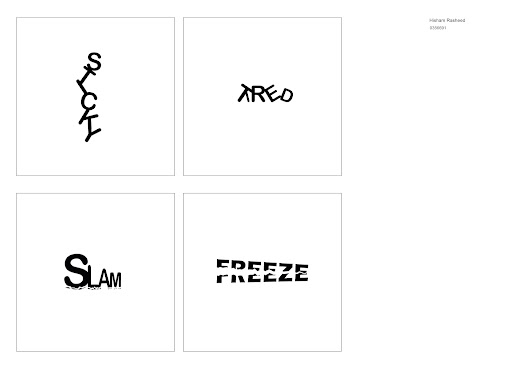
Figure 7.1: Type expression ideas (Week 1, 3rd Sep 2022)
Word 1: Sticky
the word sticky in my design portrays each letter as connected to one
another. This shows the character's stickiness.
Word 2: Tired
the word Tired, I tried to emphasize the character's tiredness by
making all the letters feel tired and lazy by each letter leaning on one
another for support. I also added the letter ' I ' in between the
letters ' T ' and ' R '
showcasing that the letter ' I ' gives support to the letter ' T
'.
Word 3: Slam
In Slam, I tried to warp the word and squeeze the 3 letters to S to
portray slamming to a wall.
Word 4: Freeze
the word freeze showcases the ice as frozen and getting
cracked.
The sketches were done in Photoshop.
Digitization

Fig 7.2: Digitization of my texts (Week 9th Sep 2022)
I had changed my freeze with a thicker font and had cracked as in going
from the left side to the right side descending.
Final

fig 7.3: Final design (Week 2 9th Sep 2022)
Type Expression Animation
We were asked to create a text animation from the four words so I chose
the word Tired.

fig 7.4: Type Animation Demo week 3 (12/08/2022)
I made the animation as if the words are falling on to each other to show
that they are tired, later I came up with the idea of how the letter D
gets trembled because of the letter E.
Final

Fig 7.5: Final Animation 'Tired' week 4 (12/08/2022)
No feedback for changes was given so I continued with the original text
animation.
Task 2: Exercises - Text Formatting
Final Task 1: Exercise 2 - Text Formatting

fig 8.1: Format with Kerning (week 4, 24 Sep 2022 )

fig 8.2: Final text formatting with grid JPEG (week 5, 27 Sep 2022)

Fig 8.3: Final text formatting without grid JPEG (week 5, 27 Sep 2022)
Final Text
Formatting PDF (Week 4, 25 Sep 2022)
[ BODY ]
Font/s: ITC Garamond Std (Booking), Futura Std (Bold)
Type Size/s: 9 pt (Body Text}, 17 pt (Heading}
Leading: 11 pt (Body Text), 22 pt (Heading)
Paragraph spacing: 11 pt
Characters per line: 55 Characters
Alignment: Left Align
Margins: 12.7 mm (Top), 100 mm (Bottom)
Columns: 4
Gutter: 5 mm
FEEDBACK
Week 2: The designs were not enough had to explore more and fix the Letter
Freeze cracks to be done on a thicker font.
Week 3: I was asked to change the design for Slam since it did not make any
sense so I had to fix that as well.
Week 4: Our text animation was submitted but were not given any feedback for
changes.
Week 5: was on medical leave and could not attend class.
REFLECTIONS
Experience
To be honest, had a tough time at the beginning of the course a very new
approach o studying also one of my weak points was typography. Struggled to
come up with creative ideas and was helpful to learn new platforms like
adobe InDesign, Text formatting and Paraphrasing were something completely
new that I didn't have any knowledge of. Always was passionate about Typo,
and the assignments add up a lot of discipline and time management. Did
struggle a lot with the assignments and I do agree I had troubles and makes
from my side for the final e-portfolio and Blog and will make sure this is
the only time that'll be happening from the next task on ill be up to date
and follow up on each task with s strict schedule about it.
Observations
Learned a lot of new things like Kerning and text formatting and how its
involvement in a process how its involvement in different media
fields.
Findings
Learned that typography has numerous rules, which necessitates some
time and effort to master and remember. Also, we must train ourselves to
study every aspect and be more sensitive when doing typography, while
also severely analyzing our work so that we can keep improving. Whenever
it comes to designing and arranging types, there is quite a lot to
ponder.
FURTHER READINGS
LETTERFORMS
by Timothy Samara
by Timothy Samara
Letterforms is a type design book. It begins with a detailed introduction to type design, then delves into the construction of letters and, from there, typefaces, before concluding with an overview of some of the recent twenty years' trends. It is a work that will appeal to both graphic designers and the general public wishing to comprehend the subject. I certainly found this book to be extremely well laid out, and the reading process would not be tedious, as one would expect from a book on this subject.

fig 9.1: Letterform cover


Comments
Post a Comment