10/10/2022 - /10/2022 / Week 7-
Week
Hisham Rasheed / 0356691
Typography / Creative Media / Taylor's Design School
Exercises
Task 3: Type Design and Communication
Lectures
Typo Task 3A Typeface construction (Shapes)
1. Research
2. sketch (about 5 to 6)
3. find a proper
reference (among the 10 typefaces)
4. Deconstruction - create a typeface
X-height should be 500pt X 500 pt
Use guides to identify the x-height, ascender, capital, and descender
lines.
Typo_Task 3A_illustrator To Fontlab5 Demo
Make sure to combine the letterforms by using shape-builder tools.
1. File - font info -metrics (key dimensions)
2. Double-click on each letter cell - bring y axis close to a letter - copy and paste
3. Metrics - Adjust kerning
4. Double-click on the space
cell to create a space
5. file - generate font - save
Instructions
Fig 1.1.1 Typography task instruction
Task 3: Type Design and Communication
Design a font based on resources from research and deconstruction of reference
typeface.
Research
Fig 1.1.2 ' A modern Serif '
https://pin.it/s78cEc3
Fig 1.1.3 ' 70's Vintage Fonts '
https://pin.it/5IjAfcb
Fig 1.1.4 ' A Constructed Roman Alphabet'
https://pin.it/YZLl4fQ
Fig 1.1.5 https://pin.it/5rqPvpK
Fig 1.1.6 ' Set of Quotation marks '
https://pin.it/3fhVBLS
Deconstruction
I picked Serifa std and chose to deconstruct the letters e, t, and r.
Fig 1.2.1 Deconstructed e, Week 8 (21/10/22)
Fig 1.2.2 Deconstructed t, Week 8 (21/10/22)
Fig 1.2.3 Deconstructed r, Week 8 (21/10/22)
Sketches
Fig 1.2.4 Font sketch 1 week 8 (21/10/22)
Fig 1.2.5 Font sketch 2 week 8 (21/10/22)
Fig 1.2.6 Font sketch 3 week 8 (21/10/22)
Digital version
I was going for a font that was thicker to the left compared to the right as
in giving a drop shadow effect from the right side. This font was derived from
the second sketch Fig 1.2.5 where all the strokes had equal widths and
noncurvy edges.
Fig 1.2.7 Digital version week 9 (21/10/22)
Measurements (from baseline)
Ascender: 330 pt
Capital height: 305 pt
Descender: -74 pt
Fig 1.2.8 Font with guides week 9 (21/10/22)
Fig 1.2.9 progress of the font week 9 (21/10/22)
Fig 1.3.1 Progress of FontLab week 9 (28/10/22)
Fig 1.3.2 Progress on Fontlab week 9 (228/10/22)
Final Submission of Typeface
Fig 1.3.3 Final Submission of Typeface week 10 (5/11/22)
Fig 1.3.4 Final submission of Typeface ' Hisham ' (pdf) (5/11/22)
Google drive link for font download
Final Submission of Poster
Fig 1.3.5 Final Submission of Poster week 10 (5/11/22)
Fig 1.3.6 Final submission of poster (pdf) (5/11/22)
Feedback
Week 11
I was not present in class including the previous weeks for feedback.
Reflection
Experience
Working on task 3 was something that really piqued my curiosity. By using
Illustrator and Fontlab, I was able to become proficient in the creation of
typefaces. My eyes have been opened by the experience of doing this work. I
used to believe that I did not have a significant interest in typography and
that I did not have a sufficient comprehension of it because, to me, it has
always felt like a subject that demands more rules and processes than it does
creativity. Having said that, while I was working on this endeavor, my
thinking shifted.
Observation
It has come to my attention that the majority of typefaces, despite their
seeming uniformity and evenness, undergo a great deal of change in order to
appear constant. These changes include overshoots and proportions. When
establishing a typeface, it is essential to pay attention to such details and
minutiae since they form a consistent font when it is seen.
Findings
In terms of class content, I learned that it is important to align angles,
thickness, curves, and other spatial details in order to unify the letters and
that it is important to balance this with an awareness of making the alphabet
shape easier to read.
Further reading
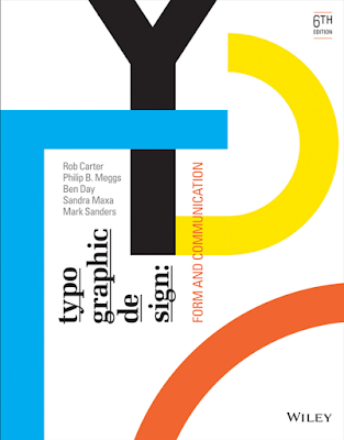
For further reading, I chose "Typographic Design: Form and Communication" from the recommended readings.
Fig 1.4.1 Typographic Design: Form and Communication (2015)
Due to the fact that many forms within an alphabet seem visually erroneous, mechanical and mathematical letterform creation can generate major spatial issues. These variations of typefaces demonstrate the optical correction required to establish aesthetic harmony within a typeface. These modifications are typically invisible to the reader because they are so subtle. However, they produce a more unified and organized appearance when combined.
.jpg)
.jpg)

.jpg)


Comments
Post a Comment