18/10/2021-15/11/2021
Hisham Rasheed (0356691)
Advanced Typograpghy / Bachelor of Design (Hons) in Creative Media
Task 3: Typo Exploration and Application
Lectures
Task 1: Excersise
Instructions
We get to pick our own project for Task 3. We are required to either examine
the use of a typeface in our area of interest (Graphic build, UI/UX,
Animation, Entertainment Design, or any other) or build a typeface to address
a challenge in that field. The final product would be the developed font used
in whatever medium relevant to the problem being solved or investigated,
including animation, 3D, print, ambient, projection, movie or game titles, the
usage of various materials, etc.
1. Proposal of Ideas
These are the slides we were asked to make in the first week of this
project to explain our ideas for this project. I chose Techno comic
typeface.
2. Explanation of chosen Idea
Techno and comic is two things I vibe to all the time apart from that I am a
huge fan of using bold and Thick fonts often. Compared to the other three
Ideas Quirky handwritten and retro are over used so I thought it will be
challenging enough to come up with something that can relate the vibes of
comics and futuristic techno.
3.Sketches
Fig 3.1 Rough Sketch (07/06/2023)
I did a few rough drawing sketches to get an idea how the font will look went
through Diffrrent but finally came to the designs shown in Fig 3.1 which is
unconventional design and inspired by Industrial design. Consistency was
another thing which I was worried to meet up the requirments with.
4.Digitisation and Exploration
Fig 4.1 Progress (14/06/2023)
I tried for uncommon letterforms and smooth curves instead of shrap and boxy
look, in fig 4.1 it shows my progress of making the letters H, G and D, It
sort of give me a stencil look because how the connection in G and H in which
the spacing is more and evident.
Fig 4.2 Uppercase and Lowercase (21/06/2023)
The letter A was the most difficult one to design did not have any idea on how
to execute a proper design that meets the consistency and Industrial look.
Finally I thought of going with the one shown in fig 4.2 in which it does look
like a cursive A but Made changes to lowercase so it wont look like that.
I tried to make the spacing inside the letters more wider which made it look
weird so I decided to arrang accordingly to the thickness and style.
Fig 4.3 progres completion (5/07/2023)
It took quite some time to get it all done especially while doing the complex
island looks to some of the letters. Consistency? well I can't complain I
didnt try. The annotations was quite hard compared to the others, I struggled
to up with techno designs that can relate and be consistent.
Fig 4.4 Annotations (5/07/2023)
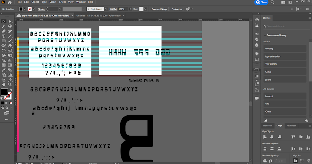
Fig 4.5 Illustrator workspace (5/07/2023)
I was going for an easy way to finish but had to go through multiple changes.
Fig 4.6 Guidelines (5/07/2023)
5.Fontlab
Fig 5.1 Fontlab workspace (13/07/2023)
I had to go througgh the old lecture playlists to work on fontlab again but
this time I tried using the sketchboard and then tagging each elements to
place as glyphs.
Fig 5.2 Sketchboard (13/07/2023)
I revisited the typography class's YouTube tutorial and followed it. According
to the guide, but I made a few minor changes and adjustments for some letters.
Fig 5.3 Fontlab Workspace (13/07/2023)
The main objective of this mix typeface was to have diversity, keeping the
uppercase very consistent for use in formal titles or font that needs to be
readable, while the lowercase was designed to be a much sillier and stylized
font to be used.
6.Type Specimen
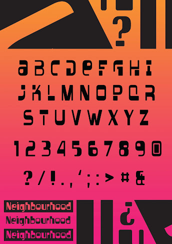
Fig 6.1 Type-Specimen and cover page (14/07/2023)
For the cover page I was inspired from a Techno night club poster.
Fig 6.2 Type specimen workspace 2,3,4 and 5
All the specimen were done on Photoshop inspired by quirky funky posters.
7.Applications
Fig 7.1 Illustrator and Photoshop workspace
I used both photoshop and illustrator for the designs the artworks are my
personal work done and I tried the font on it.
Final Task 3
1. ttf link
2. Type Specimen
Fig.8.1 Final Type Specimen - JPEG (06/07/2023)
Fig.8.2 Final Type Specimen - JPEG (14/07/2023)
Fig.8.3 Final Type Specimen - JPEG (14/07/2023)
Fig.8.4 Final Type Specimen - JPEG (14/07/2023)
Fig.8.5 Final Type Specimen - JPEG (14/07/2023)
Fig 8.6 Final Type Specimen - PDF (14/07/23)
3. Applications
Fig.8.6 Final Application Poster - JPEG (14/07/2023)
Fig.8.7 Final Application Poster - JPEG (14/07/2023)
Fig.8.8 Final Application Poster - JPEG (14/07/2023)
Fig.8.9 Final Application Poster - JPEG (14/07/2023)
Fig 8.10 Final Application Poster and Mock up (14/07/23)
Reflection
Experience
The main objective of this mix typeface was to have diversity, keeping the
uppercase very consistent for use in formal titles or font that needs to be
readable, while the lowercase was designed to be a much sillier and stylized
font to be used.
Observations
among the most significant things I observed was how minute adjustments and
slight variations may significantly alter a typeface's personality and
attitude. Where a curve is positioned, what angle a serif is at, or how the
weight of a stroke stretches out may completely alter the feel and tone of a
letter. I became aware of the significance of accuracy and meticulousness
while creating type designs that look beautiful and work properly.
Findings
I developed an admiration for the precise balancing act type design makes
between emotion and intelligibility. While it was tempting to solely
concentrate on creating letters that looked intriguing and distinctive, I
quickly came to the conclusion that legibility and reading are much more
crucial. It has become crucial to how I design type that the characters be
clear and understandable in a variety of settings and sizes. This harmony of
form and purpose prompted me to come up with innovative ideas for how to
give my typefaces personality and character while keeping them functional.
Further reading
Fig.8.1 Typographic design: Form and communication (2015)
Composition and Layout: Examining principles of visual composition, balance,
and rhythm in typographic layouts, including the use of whitespace, alignment,
and grouping.
Legibility and Readability: Understanding the factors that affect legibility,
such as letter spacing, line spacing, contrast, and choosing appropriate
typefaces for different contexts.
Typography in Digital Media: Exploring typographic considerations and
techniques for screen-based media, responsive design, and the use of web
fonts.


Comments
Post a Comment